Loved your post. You make many good points. I’ve already addressed (agreed with) some of them in other posts in this thread, so I won’t repeat myself here. However, you bring up an interesting point — more meaningful statistics. I couldn’t agree with you more. I’d love it if Memrise had “frequency” courses — courses ordered by frequency in some standard corpora for a language — and then provided statistics by 1,000 words and then allowed you to choose which set of 1,000 — 1st, 2nd, 3rd, … — to work on. Most of us don’t have time to study languages as much as we would like to, so developing ways to make it as efficient as possible with specific, objective feedback, is really important for serious language learners.
Having said all of that, I am now looking at the new learning stats page and I must say that I love it. I love knowing which day of the week I tend to learn most often and which time of day I tend to learn best. Knowing which course(s) I’ve spent the most time on and how much time I’ve spent on them is also really helpful. Please don’t ever remove these features!
Two ways: in the beta, you’ll find the same filter controls as before on the top right, that little greenish button that looks like a watch (only Memrise will know why it seemed logical to them to make it look like that!).
And apart from that, you can always look up the courses that appear on your teaching page (albeit these might leave out the ones that aren’t public - I’m not sure)
Agreed @Olaf.Rabbachin and I search by “DW7”.
(I often add “This course is now supported by DW7” in the long [web] description which then finds all the courses I support.)
The Memrise Alpha is terrible! The features and appearance in the previous version are informative and better. I have revert to the previous version after facing several issues. Please don’t make this unhelpful and not practical new design as in Alpha. Thank you.
I ended up adapting by loading all courses in one tab, and opening every course as I go up in a new tab. This way I don’t have to wait for everything to load every time I finish a course, which is slow.
Still not ideal, because it’s a little hard to tell which courses are completed, and I can miss one if I’m not paying attention.
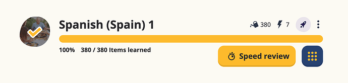
I do think it’s an improvement to now be able to better distinguish finished courses from ongoing ones. But why of all things does it have to be an overlay that renders the course “icon” completely irrecognizable. Also, the overlay makes all courses’ icons look pretty much the same.
BTW, what’s so wrong about utilizing colors (I’m not the only one who suggested this several times, with not a single comment as to why you think this would be a bad idea)?
Also, it would help to better see which courses need to be worked on in order to keep a streak. Currently, the only means is the dial that is drawn around the “rocket”.
I agree with Olaf’s points, particulary in respect of the overlay on the course icon.
On a separate point, do you have any plans to rationalize the imagery? The close proximity of the unrelated watering can and the space rocket draws attention to the fact that you are continuing to use icons from two very different earlier versions of Memrise. Not only does it look weird but it must be confusing for anyone who has not been learning with Memrise since the days of the flower garden and then ‘Ziggy’.
PS, I agree about the overlay with a tick hides the course icon, the mixed themes and generally it would be great to have different colours for watering and planting (I’ve been caught out in the past).
This might be above you guys or too big an ask with so many logistics, but Memrise Forums are SOOO underused! I think it would really benefit from having the forums readily available from the Memrise homepage. Maybe if it was a bit like…D… Duo…lingo (vomit in my mouth), where it was visible as a whole tab at the top of the menu or some sort of chat bubble icon that people could click on to get here. This is cause, frankly, I think most users don’t even know there is a Memrise forum, and by adding it to the homepage, I guess you can pass it off like it is a “new feature” or something. Idk. Just my thoughts!
I guess part of the problem is that a lot of Memrise users use the app version, which only links to the forum from within the depths of the “Help” section. At least the web version has a forum link at the foot of the Dashboard (Main Homepage) and at the foot of each course homepage/Level page - although users need to scroll down to see it.
Only around 21,700 people have joined the forum since it was formed some 5 years ago and there have only been 600 active users on the forum in the last 30 days (which is fairly typical). Certainly, giving the link more prominence would help boost the numbers. It would have my support.
Thanks! This is great news. I think this control panel will make the site much more convenient and pleasant to use. For me personally, aesthetics are also important. I recently started doing web design and I often visit Master Bundles There are many interesting ideas for creating designs for social networks here. I am constantly learning about trends in logos, backgrounds, colors, and more. For me, this is actually very useful and valuable information.
Hi,
I really like the new design graphically, but as previously said I find it really long to load.
As a multiple language learner, I usually review all language by language and not course by course. I like that you left a button to do so, but 2 things are a bit annoying :
Every time I load the page I need to reselect a language because it always loads the main page. It takes 2 more clicks to load every review session.
I don’t really like the 99+ not showing the actual number, I usually don’t prepare the same for 120 and for 500.
Other than that, I liked seeing my overall streak on the main page, it used to motivate me. I don’t really care about the individual courses streak as I don’t always have words to review on each on them. I would love a streak per language though.
As usual, I love the improvements. The extra wide space does not bother me, especially knowing that the website is made more responsive without having to stack elements or create overflow. A couple of things I see/agree with from the other comments:
a checkmark for a complete course would be preferred instead of the dark overlay
I would like to have more keyboard shortcuts to access the individual courses or for choosing the type of review for the words
more classroom tools for teachers (I know this is probably a longer term project, but I have all my students using this program and they have to turn in screen shots. I wish there was a way for them to give me access to their stats so I could see their total number of words, words needing reviewing, etc.
Thank you for all your hard work and for the opportunity to speak to the design. Keep up the great work!
i like beta better with the goals of time limits instead of how many words you are going to learn that day…also it seems like i learn better on the beta system if there was a time slot of 30 minutes instead of 45 that would be fantastic! Thanks!