We’re excited to announce that we are launching a new version of the dashboard on the Memrise website - at first exclusively to our users enrolled in the alpha programme in order to collect feedback on this early stage release. The dashboard is a key part of the user experience and with this work we are aiming at:
Having a cleaner design that allows you to focus on your key workflows
Set us up for faster delivery of new features
The current dashboard is written in a way that is hard to maintain and modify - the dashboard being released to alpha will allow us to improve your experience faster
Continue working towards a more consistent experience across platforms
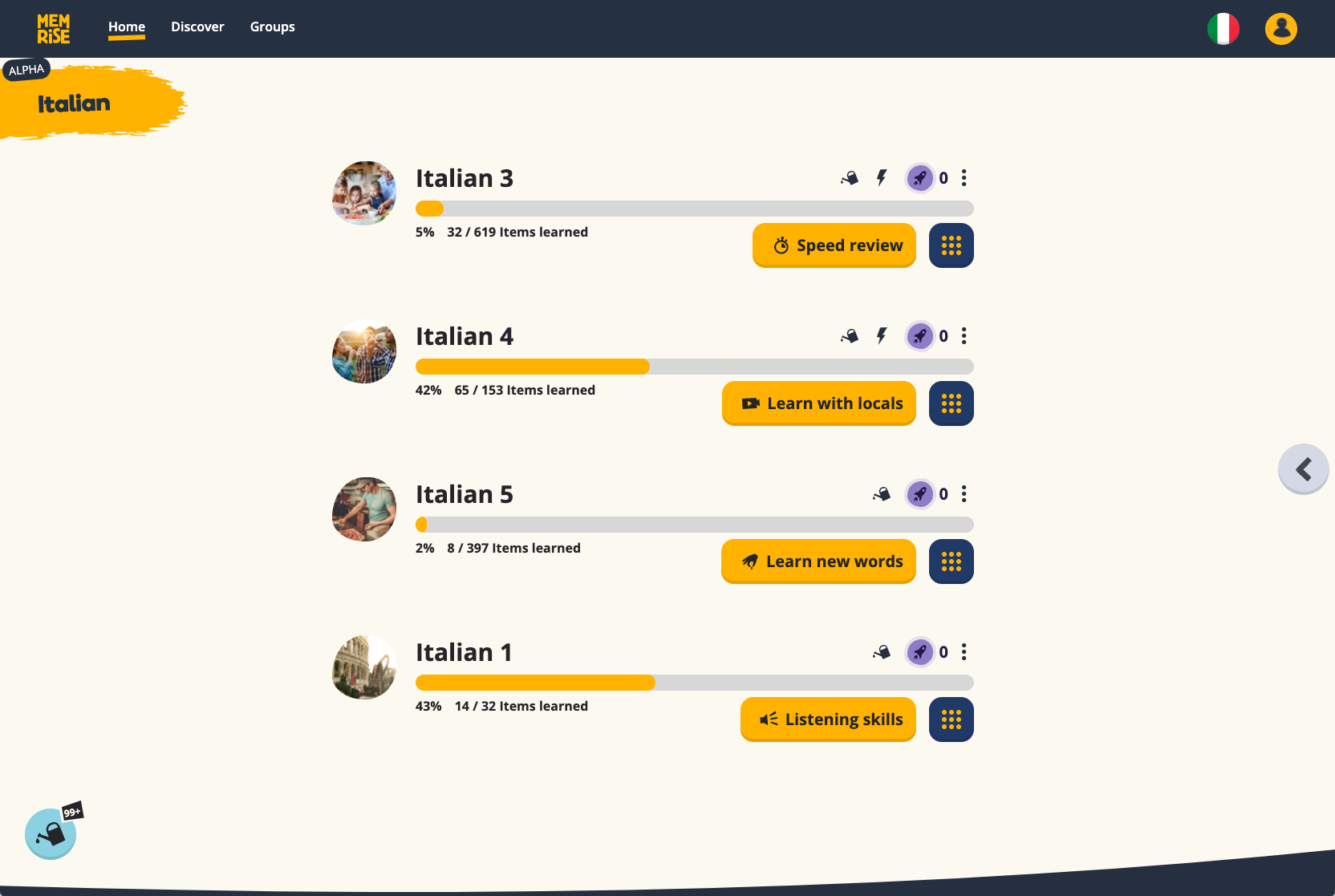
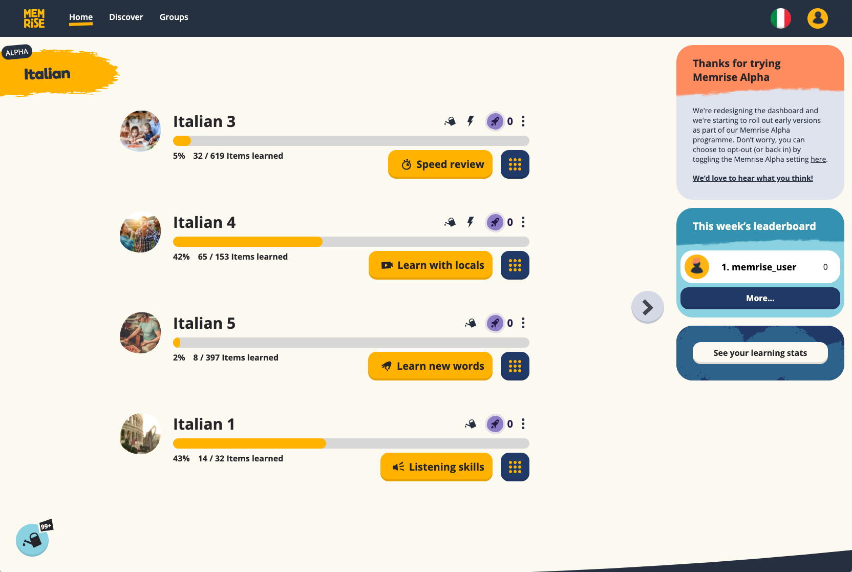
Here are some images of how the dashboard looks in case you are not enrolled in the alpha programme:
Give it a go! We’re very excited about this milestone and look forward to hearing from you! We’ll be collecting your feedback and then we will launch an improved version of the dashboard to a wider user base
You can leave feedback about the dashboard as a response to this message.
We are aware of the following limitations in this early release:
The category review button (the one on the bottom left corner of the image above) is linking to review sessions from our old review session UI experience.
The button with an Italian flag in the top right corner of the image above serves to filter all the courses you are enrolled in that belong to a certain category - in the image the category is “Italian”. If you go into a learning session, when you come back to the dashboard, the category filter will default to “Recently Learned” instead of “Italian”.
We’ll be launching the dashboard gradually in the afternoon of the 4th of October.
PS - If you are curious and want to join the alpha programme, you can do so here.
As a power user, this dashboard is horrible. I have 12 courses with daily goals and review completed courses with items due. (Though there is not enough time in the day, so I have to prioritize which completed courses to review.) The new dashboard only loads 4 courses at the start, loads 4 more courses with each click, and has no immediate indication of how many items are due for each course. It’s a pain.
Please make it optional how many courses are loaded by default. That would make the new design more tolerable. Better yet, allow the page to load more courses by scrolling down the way it was with the previous dashboard.
It would also be better to show how many items in each course are due at a glance, without having to hover or click on anything, as it does in the phone app.
Hey! This is a great step forward, I think. At this point, it should be pretty good where it is for a while It definitely seems more accessible for a wide audience.
I wonder if there should be more text involved, though, to explain some of the vague aspects? More so if you hover over, like when you get the number of words in a review session by mousing over the watering can. I wasn’t sure where to find the language filter before seeing this post (in fact, it seemed absent… I’m not sure if it’s just me who didn’t notice that the hotbar was significant?) &, more particularly, it would be nice to be able to see how close you are to your daily goal in both a progress bar(circle) as well as a numerical amount.
…though I get that that is covered slightly by filtering to a language & viewing the leaderboard there. ^^’
Good choices you made there! I hope that it has your intended effect of being easier from a development standpoint.
Took a quick look. I have no idea what the small picture inside the purple (apparently the goal setter) is supposed to be. The order of the filter categories seems random, instead of alphabetical.
The new dashboard screen is narrower again so that even less than a third of my widescreen monitor is utilized.
And it does not contain the information I want to see at a glance. That is which courses need reviewing and the number of items to review and information about obtaining my daily goals.
So I immediately opted out again.
By the way, the automatic preselection of the beta when saving settings is really annoying.
I think you mean the rocketship. It’s a holdover from when they had an alien mascot and ties in the theme of accelerated learning.
I agree with you that they’re going overboard with simplifying the screen. Even the phone app has more information and a better UI than the web alpha version at this point.
I thought it might be a rocket ship but it makes no sense to me. Why whould you put a rocket on the new dashboard next to the watering can which is a leftover from the gardening theme?
The company seems to be struggling with their sense of identity. There was a gardening theme, an alien mascot, and now the only thing that seems to identify it is the color yellow. I think they should regroup and come up with something more cohesive and unique, and stop trying to minimize everything at the expense of user efficiency.
I don’t like it. I have to click multiple times to see all my courses, and it doesn’t show how much I need to reach my daily goal.
I also can’t see the graph that says how well am I doing in different times of the day. I thought having access to those metrics was one of the benefits of being a paying subscriber.
It just shows less information overall and is a big downgrade from the old one.
Ah, I can see my learning stats if I click on the right part of the screen, but I still don’t like the redesign. It’s like I have to work more to access the same information.
Ah and it meters the daily progress by filling up the circle around the rocket. yeah… I’m not a fan
Yeah it’s the clicking thing. I do about 12 courses a day and I like to go from the bottom of the list to the top. New design makes it so I have to click multiple times to reach the bottom of the list. annoying.
Same preference here. 12 courses a day, from the bottom to the top of the list, then completed courses depending on how many items are due per course. I have to think the company is prioritizing people who only take a few courses at a time and don’t review completed courses.
Agreed. Somehow this minimalistic design loads slower than the previous one. (???) 3 seconds to load the dashboard, 3 seconds to load more courses… It’s just minimalistic for the sake of being minimalistic.
A better redesign would be to let the user choose a night mode, like every other modern website already does. People spend a long time on the website and the theme should reflect that and make it more comfortable.
Hi! Thanks for your feedback which is really valuable.
We’re working on loading more courses automatically as you scroll, improving the speed slightly, and showing the number of items to review / difficult words without needing to hover the mouse.
Like many others here, It is really SO MUCH better to see all the numbers straight up. When I go onto Memrise, the first thing I want to see is how many words to review, and how many challenging words left, so I would like to have that right next to the symbol, and not have to hover over it to find that out.
Other than that, looks shmick! I really like how the watering-can disappears once you have reviewed all the words, etc. Done well
I suppose you’re aiming for a clean look. To me this is - once more - over the top. Here are my thoughts:
The page simply ignores most of the available screen real estate. There’s quite a bit of vertical space too, but I still have to scroll down, take a look:
I have to click “Load more courses” countless times to see all the courses I work on every day. It just took me 35s to repeatedly load them and scroll down. That’s even worse than it was before!
The floating area to the right has to be made visible again after each visit. I’d like it to be visible when I load the page (no need to get even less data!).
There’s fancy buttons without text now; these should have (at least!) a tip-text visible upon hovering over them. I don’t get why descriptive text could be a problem (Memrise is about language, isn’t it?)
Finished courses should show a green bar instead of a yellow one, or at least use a color that differentiates finished courses from ongoing ones.
Difficult words: The symbol appears, but the actual count of difficult words is missing
I suppose the fact that “Courses” now reads “Discover” was a deliberate change. Or wasn’t it?
I will be opting out of the Alpha version of your dashboard. I do enjoy seeing what is in need of review as well as being able to quickly glance at my monthly learning stats. It gives me more motivation to see that I have a 70+ day streak and that I have over a few hundred “events” per day. Also, the showcase of how many words I’ve learned throughout my journey fuels the fire to carry on with my courses. Perhaps if this is visible in the alpha I will switch back. For now, I will carry on with using the previous interface. Thank you for creating the forum for us to express our views. Keep doing a great job Memrise team. It is much appreciated.
I’ve got another one. I miss the clock that tells me how much time I’ve got left to complete my dailies.
I can’t figure out how to access this one at all. It’s not in my learning statistics, and it’s nowhere on the dashboard not even if I hover the rocket.
It’s just a net loss of a very important feature. I mean I can look at my computer’s clock and subtract from midnight lol, but sometimes I have to cheat by changing my timezone so I can complete the lessons “on time” and it’s helpful to have the time function for that.
Hello. This new dashboard is much worse than the previous one. It contains much less information than the old one. I immediately switched to the previous dashboard, and I hope that it will not be changed.